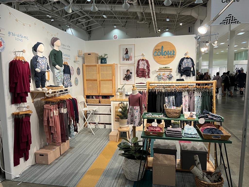
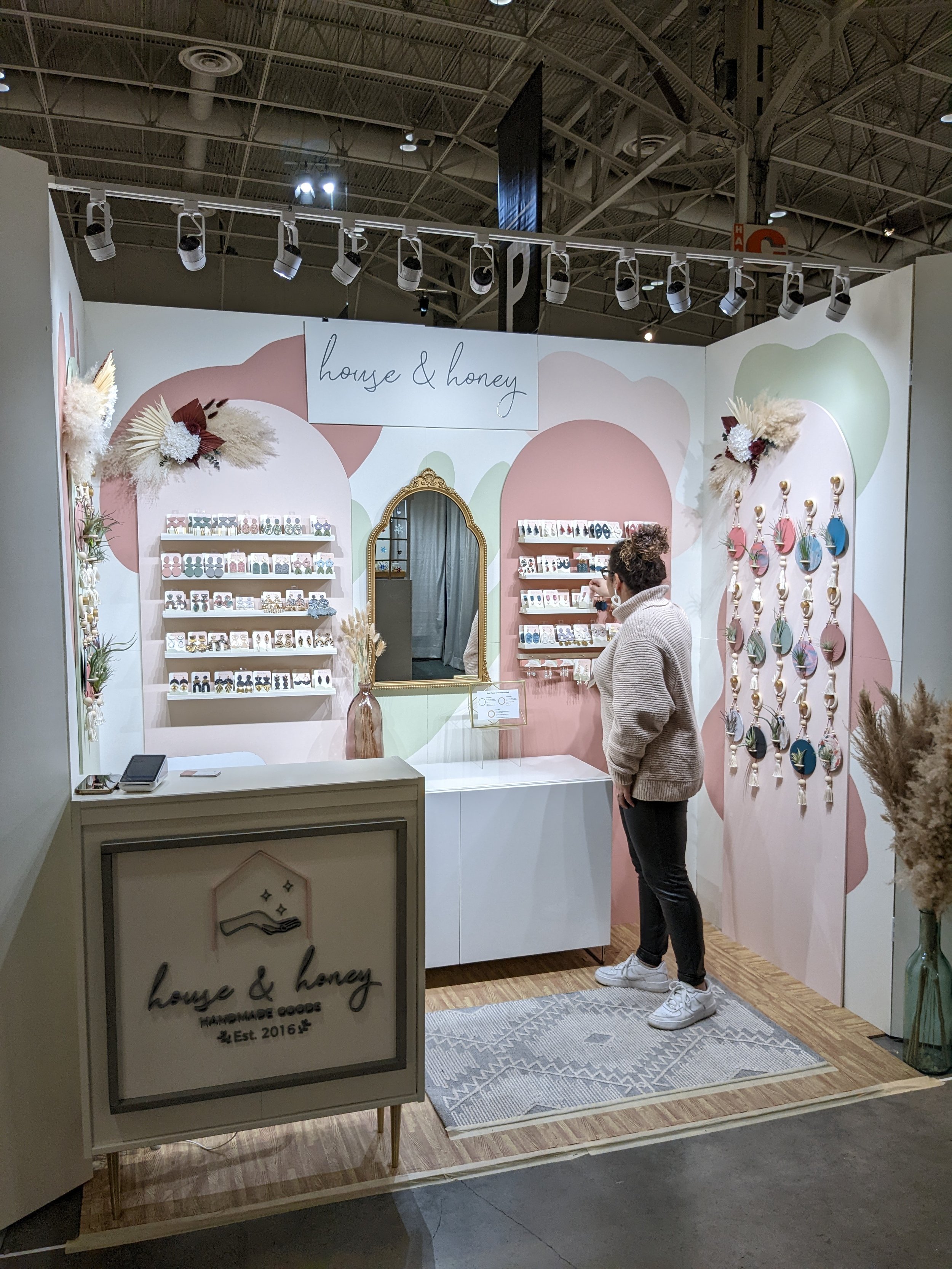
5 Elements of Visual Merchandising in Booth Design & Holiday Markets
It is that time of the year again! We are entering the season of goodwill, and we all feel like spreading it. Whether you do it for commercial, social or even environmental reasons, local markets seem like an obvious choice for spreading the holiday spirit, especially if you are a small business owner. In Toronto we are also lucky enough to have a number of small markets that pop up in our neighborhoods in December.
So, how can vendors make the most of each market’s potential in terms of creative visual merchandising and event design?
We are a visual merchandising agency that loves supporting markets. In 2019, we supported the Toronto Christmas Market located in The Distillery District- now known as the Toronto Winter Village through consulting with vendors and running design services, sourcing for products and labor for installations and merchandising. In doing so we were able to create personalized interactions between each company’s product and consumers, keeping in mind what defined the market culture without losing sight of overarching goals. There were a total of 15 booths set up by us using wall treatments, fixtures setups and lighting solutions while also finding ways to integrate product placement within them so they would shine brightly when it came time to sell them off or gift them away to someone else looking for something new. We couldn’t help but to feel proud everytime we saw how these businesses’ products shined; feeling like we had succeeded in staying true to what this particular market was all about.
Photo credits: Toronto Guardian
Similarly but still uniquely different, we offer an array of services at One of a Kind Show to take exhibitors’ presentations from good to great. Our team provides consultation, training, designing and judging services to help each maker stand out from the pack. The result has been a more elevated and inviting atmosphere that speaks volumes about its visitors’ hard work and dedication to their artistry.
If you are looking for guidance on how to create a successful booth design for your business, here are 5 crucial elements of visual merchandising that you need to remember when designing a booth:
1. Structure. We think it’s important to consider where you want your visitors to focus, which is usually either the product or you - so make sure to choose wisely! To do this most efficiently you’ll need a layout that provides both cleanliness and attention-grabbing elements. Soft walls might seem like an easy go-to but they’re actually quite restrictive and make displays more difficult because they don’t provide structure. With hard walls you can easily control light sources coming from different angles depending on where you place things inside the booth, giving off a polished feel without sacrificing any visibility at all. You can also get creative with layouts by using these structures for support - which means building anything besides straight lines becomes possible. If this sounds appealing then we recommend going with hard walls because nothing compares when it comes to showcasing high quality products without flaw.
2. Branding. There are three main categories to keep in mind: logos and labels, colours/theme and finishings. For example: signage should always identify what the company does or sells as well as its primary colors (which should correlate with other areas of your booth). This will not only identify who you are but create an atmosphere suitable for how the products are presented. When it comes down to showing off used fixtures or props such as mannequins, if they are able to be refurbished then go for it! But remember: used is okay, outdated or damaged is not.
3. Layout. Planning for placement of fixtures and walls to intentionally create what type of customer journey you want is important. Make use of all your space! It’s important to have product displays, a showroom feel, employee spaces, areas for storage. If there’s an empty area or something else that seems unfinished - give it purpose. This doesn’t mean filling it up entirely but rather giving it purpose through negative space (or white space as some people call it) which can help visually break things up. Once everything has been mocked up, be sure to ask others how they feel about the overall experience and whether anything needs adjusting before finalizing the process.
4. Lighting. Proper lighting can make all the difference in determining how aesthetically pleasing an event space is. A little bit of illumination goes a long way; it illuminates the entire space and makes everything feel bigger and brighter. One crucial aspect to keep in mind when planning out your event space is whether or not there are any dark areas that might go unnoticed without adequate lights; shelves, nooks, niches, and areas all need proper illumination if they’re going to be shown off properly. But don’t worry about being too distracting; there’s always ample opportunity for decoration later! However you decide on using lights - either subtle or splashy - remember that excessive glare will ruin everything. You want people looking at your products instead of their hairline because of an annoying spotlight shining down on them. So find some balance between enough light (but not blinding) so people can see properly but also maintain the aesthetic appeal of what you’ve created!
5. Shoppability. A well-designed booth isn’t just eye-catching - it also needs to be profitable! Whether you’re promoting your products, your brand, or both, its selling potential needs to exceed expectations. This includes making the products displayed accessible and communicating its selling points clearly so potential buyers will stay interested enough to make a purchase. Presenting products effectively means that at every step of customer interaction, they’ll understand why these items belong in their lives.
Having been to many trade shows before, we can attest to their differences. Some are large, some are small, but they are all fairly distinct from one another. If you were to picture all of them at once, you’d see that each example is unique and distinct, even though they all require booth designs. There are overarching elements that are important no matter what – it is these elements that make different markets and customers respond to designs differently. In the end, we’re judged on several factors when we design booths for events like the One of a Kind Show; we strive to make every booth as distinct as possible while still fitting into the general guidelines of the event. We’re looking for overall quality in what we do, and with our help, you can compete against others with your professional presentation.
Are you puzzling over the layout of your booth or if your current setup is the best for you and your business? Book a Discovery Call with us to find out how we can help - whether it’s a small table set-up or a large mini store, we’re happy to serve our marketplace clients!


